top of page
Top Shelf Comedy
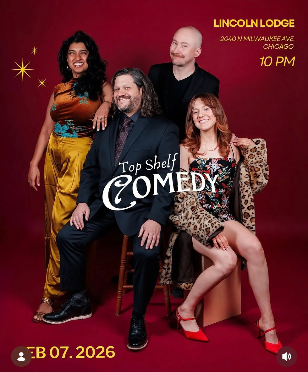
A bold, vintage-inspired identity for a comedy show that doesn’t take itself too seriously. Built around mid-century liquor ads, the system plays with scale, humor, and physical interaction — turning typography into something performers can touch, climb, and disrupt.
Client
Top Shelf Comedy
Date
February 2026
Role
Graphic Designer
Skills
Brand Identity Design
Visual Direction
Logo Design
Promotional Material Design
Logo
.png)


Approach
Rather than designing a static logo, the identity was developed as a repeatable visual gag system.
-
Oversized, high-impact typography
-
Physical interaction between subject + type
-
Vintage advertising references reinterpreted through comedy
-
Flexible layouts for posters, social, and screens


Process
The process began with creating a series of base visual assets intended to function as a flexible system rather than fixed compositions. I explored abstracted architectural forms, material-driven imagery, and high-contrast compositions that referenced Chicago’s built environment without leaning on recognizable symbols or tourist imagery.



bottom of page